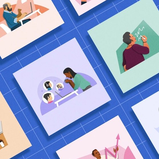
Building Scalable Illustrations for Your Design System
May 18, 10:55 PM
What Indeed learned from crafting a brand tool that all teams can use, on Indeed Design.
indeed.design

medium bookmark / Raindrop.io | A proper sharing feature has been part of iOS for years. It has a consistent, system-level UI that’s available from most any app with anything worth sharing and yet no one seems to use it. Well, no one but us geeks, right? Everyone else just takes screenshots—which require mastering an […]
medium bookmark / Raindrop.io |
A proper sharing feature has been part of iOS for years. It has a consistent, system-level UI that’s available from most any app with anything worth sharing and yet no one seems to use it. Well, no one but us geeks, right? Everyone else just takes screenshots—which require mastering an unintuitive multi-button press and a fair amount of dexterity.
I moaned when people started posting screenshots of highlighted selections from articles to beat the 140 character limit on Twitter because they just shared a picture of text that I can’t copy, reformat, enlarge, etc. I’ve been that guy when friends send a screenshot of a product rather than a link. Sharing properly is a very type-A process that I dutifully complete out of ease for my friends and respect for the content!
That’s why my inner pedant was delighted when Instagram noticed I had taken a screenshot and gently nudged me to use the proper share features.
Use the hardware buttons to make a screenshot and Instagram is all, “Oh silly luddite, please send people a functional link.” Tapping the Share banner in the second screenshot corrects your bad form and helps you share a URL.
It’s a really nice solution that gently guides the user to the correct way to share. I’ll admit this is probably the solution I’d have designed, too. The built-in Share feature should be easier and yet friends and relatives who can barely download an app find screenshotting to be second nature.
That’s why I was delighted to see Amazon’s take on the same problem. Where Instagram’s design is a gentle scolding, Ahem! I see you have no idea what you’re doing, Amazon’s much scrappier version says, Oh you made a screenshot? Cool, lemme help you with that.
“I got you, bro.”
Amazon shows a similar, though more obvious, banner after you make a screenshot but it does things a little differently after that. For one, it uses the system’s Share Sheet which is familiar and provides a lot more options than Instagram’s custom one.
More important than that, however, is the payload. Amazon shares my screenshot and then adds a URL to it. It’s a subtle difference but Amazon’s version makes me feel better. Where Instagram gets my intent and tries to help me do the right thing, it replaced my content. Amazon’s design let’s me do what I intended but helps me do it better. In the screenshots above a major difference is posting to Twitter. Instagram’s post wouldn’t include an image, Amazon’s would.
As a designer I love being surprised by solutions I wouldn’t have come up with. I can absolutely see how Instagram arrived at their solution. Part of UI design is guiding users back when they go off track. Designers want to change the world by making things easier, more understandable, more enjoyable—more ideal. That completely resonates but I can’t help but admire the audacity of Amazon’s designers who have accepted the world as it is and humbly offered a helping hand. Kudos!
What Indeed learned from crafting a brand tool that all teams can use, on Indeed Design.
Learn about building and scaling a design system for an enterprise brand that lives in 8 different markets across MENA., on UXPin.
Further insights from interviews with software engineers about how to tactfully handle their UX feedback.. By Taylor Palmer, on UX Tools.

Plenty of exciting news presented during this year’s Config conference. If you are curious about how they will impact your favorite design tool and, in the end, the entire workflow, just like last year – grab the mug of your

Styles come and go very fast. However, to address the needs of our customers, designers have to be skilled in every modern one. While glassmorphism still feels up to date, there is a trend gaining popularity – Claymorphism. It was

Compare when and why you should use {prototype-fluid} instead of {prototype} in Icons8 Lunacy or Sketch app. The post Tutorial – How to make your iOS prototypes shine like bright stars in the sky appeared first on Sketch2React Blog.

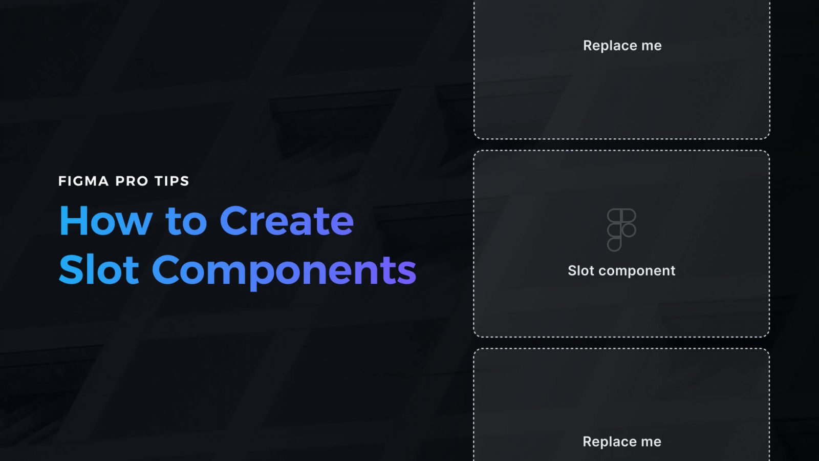
Creating a design in Figma is one thing. The second one is to make it efficient to use. If you want to work faster with your components and UI library, if you’re going to guide other people using your design
One of the most powerful features of Marcode is that you can add custom CSS directly affecting layers and groups inside Sketch or Icons8 Lunacy. Adding a fast and small CSS animation library like Animate.css is a breeze, not to

Challenge yourself to build and ship a complete product in 30 days with a community of supportive women
We just released a brand new companion app for Sketch and Icons8 Lunacy called Marcode. We also released our first premium Sketch plugin, Writer. The post Turn design into iOS & Android apps appeared first on Sketch2React Blog.

Building a portfolio that will help you get a job or a new project is the Holy Grail of most of us. Through the years of my career, I was fortunate to be on both sides – I took part

AI-driven updates, curated by humans and hand-edited for the Prototypr community