Building Scalable Illustrations for Your Design System
May 18, 10:55 PM
What Indeed learned from crafting a brand tool that all teams can use, on Indeed Design.
indeed.design

medium bookmark / Raindrop.io | Prototyping tools for UI/UX work have gotten incredibly sophisticated in recent years. There are many different tools you can choose from, such as Framer.JS or Flinto but at Vimeo Principle for Mac is our go-to. The beautiful thing about Principle is that it requires no coding experience or coding knowledge, […]
medium bookmark / Raindrop.io |
Prototyping tools for UI/UX work have gotten incredibly sophisticated in recent years. There are many different tools you can choose from, such as Framer.JS or Flinto but at Vimeo Principle for Mac is our go-to.
The beautiful thing about Principle is that it requires no coding experience or coding knowledge, and has a relatively shallow learning curve. Within minutes you can turn your static sketch files into living prototypes. And they’re extremely convincing — It’s hard to tell what’s a prototype and what’s a real app.
Principle has been a dream for our developers; they love how easily it communicates design interactions and how it gives them a better sense of UI implementation than a sketch file ever could. It also saves the back and forth (valuable dev time) of trying out different interactions that may seem great in sketch, but not so great in reality.
I’m going to talk about a few projects we’ve recently used Principle for, and how we’ve incorporated it into our design process and dev hand-off.
The Principle files (.prd) are included below each video.
Blooming
Working with Android TV was an incredible learning experience for both design and development. One major design system within Android TV is cell states. There are a ton: A cell that’s focused, which is inside of a focused row. A cell that’s unfocused inside a focused row. A cell thats unfocused in an unfocused row. Then you have the nav. The cells have a collapsed vs expanded state.
At anytime a user should know where they’re focused and what would happen if they use the remote up, down, left or right. Oh, and everything returns to center focus both vertically and horizontally.
To make sense of all this, we’ve created our own design system, called Blooming, for cell focus states that integrates on-top of Android’s Leanback, and helps provide clarity to the user. It also provides a solid design system that can be applied throughout the Android Leanback platform.
It’s called Blooming, because as you get closer to the focused cell, more information is presented, or bloomed, to the user. This includes the amount of text shown, the information presented, color, and z-axis (shadows).
When we designed this, it looked like it made a lot of sense, but to test it, pre-principle era, would require an actual development build or days in After Effects. Dev time is extremely valuable, so making changes and reworking details over and over isn’t the most ideal situation.
In principle we put a blocky version of what the Blooming cells would look like to get an initial feel for it.
The entire team was thrilled with the prototype so we built it. Below is the actual development implementation our team created based on Principle, including the same animation curves! It’s perfect. We have great developers and are hiring more!
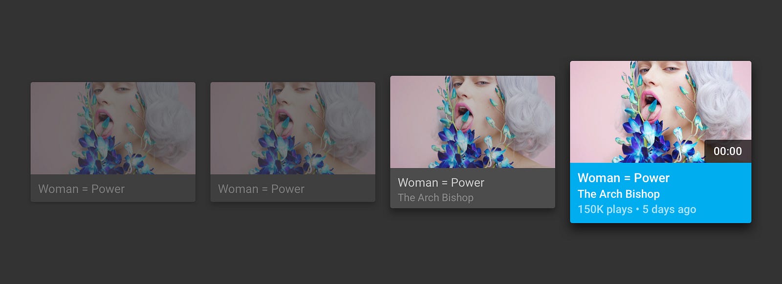
Input interactions seem to be one of the most highly commented-on designs among our team during crit. We have twice a week critique sessions where all of the designers at Vimeo get together to get and give feedback. Anything from a sketch on a piece of paper, to finished prototypes, to marketing campaigns, it’s all there.
Input interactions were recently shown during crit, and we went through a ton of error state options. Using Principles components, we were able to go through 15 different error states and one by one give a Yay or Nay. All created without a single line of code. The Iris team at Vimeo is refreshing the entire component library on Vimeo — Input interactions being one of them
Iris is composed of patterns found within design that can be reused and standardize a system that will allow for scalability. In other words, Iris is the coded language built for Vimeo’s Design System.
The Designs Systems team also referred to as team Iris at Vimeo is in charge of building out reusable, scalable components from patterns vetted by both the design and development teams. The aim is to build beautiful work that fits the needs of the developers who use it and also meet the standards of the designers who crafted those patterns
Below is a prototype of other various form fields. These include hover states, click states, empty states, active/inactive buttons etc. From here, the Iris team can take a look and provide feedback instantly, with any questions or thoughts around building it.
Day Tripper Loader
Day Tripper is a recently launched Android app that will make your next commute way more entertaining. Watch curated videos, hand-picked specially for you and your trip. Day Tripper started out as a Vimeo Jam; a twice a year, 3 day hackathon, where we can work on anything and anything. In fact, this blog post is a Vimeo Jam project!
While we’re usually prototyping complex interactions and fancy eye-candy, sometimes the best animations are the subtle ones.
Day Tripper Loader Transition.prd
For Day Tripper, we wanted a nice way to present the staff curated content, and transition in a way that would encourage users to tap play. With that, we built a prototype that demonstrated the loading screen to playlist screen. We have copy on the loading screen that transitions into the playlist copy (and it had to be seamless.) Content appears from the bottom and settles in. With a slight delay, the play button follows.
The Android team once again pulled through and nailed the animation. Check out Day Tripper here.
Cameo Onboarding
This prototype was one of the more complex ones we’ve created. We wanted an engaging and exciting onboarding experience for new users when they download Cameo. We followed the traditional paginated set-up where you swipe to advance, but focused it around a story, than random features.
As you progress through the walk through, you follow to the story of these clips. We started with an animation test. The first was an experience with separate images that you swipe left and right for (and they appear from right). This works, and can look great with nice illustrations, but we wanted to do something that had a little more jazz.
We thought about keeping one element that travels through the walkthrough and elements would interact around it. To decide whether or not this was a good move, before we moved into full development, we built the swiping prototypes.
Cameo Transition Animation Test.prd
After showing this to the team and talking with the developers about animating elements, we went into full design and created the prototype above.
We’re constantly refining our process and tools. In 2014 we were still using photoshop and Sketch was a mystery. Now we’re all on Sketch. Zeplin for developer handoff, Invision for flows, and Principle for prototypes.
If you like what we’re working on and are interested in joining our design team, or learn more about what we’re working on, check out the jobs page, or email me directly. I’m happy to discuss our process and the design team at Vimeo!
Stephen M Levinson
Lead Designer, Entertainment
stephenl@vimeo.com
What Indeed learned from crafting a brand tool that all teams can use, on Indeed Design.
Learn about building and scaling a design system for an enterprise brand that lives in 8 different markets across MENA., on UXPin.
Further insights from interviews with software engineers about how to tactfully handle their UX feedback.. By Taylor Palmer, on UX Tools.

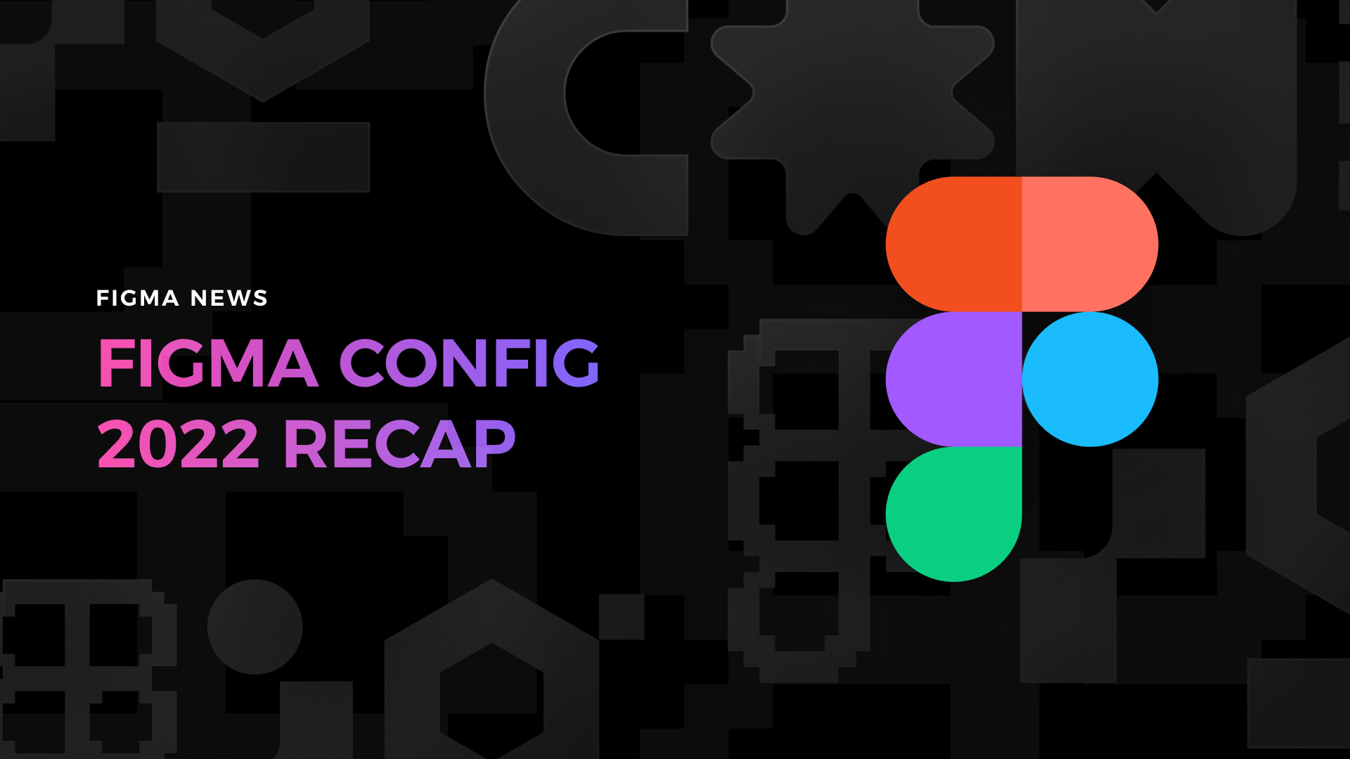
Plenty of exciting news presented during this year’s Config conference. If you are curious about how they will impact your favorite design tool and, in the end, the entire workflow, just like last year – grab the mug of your
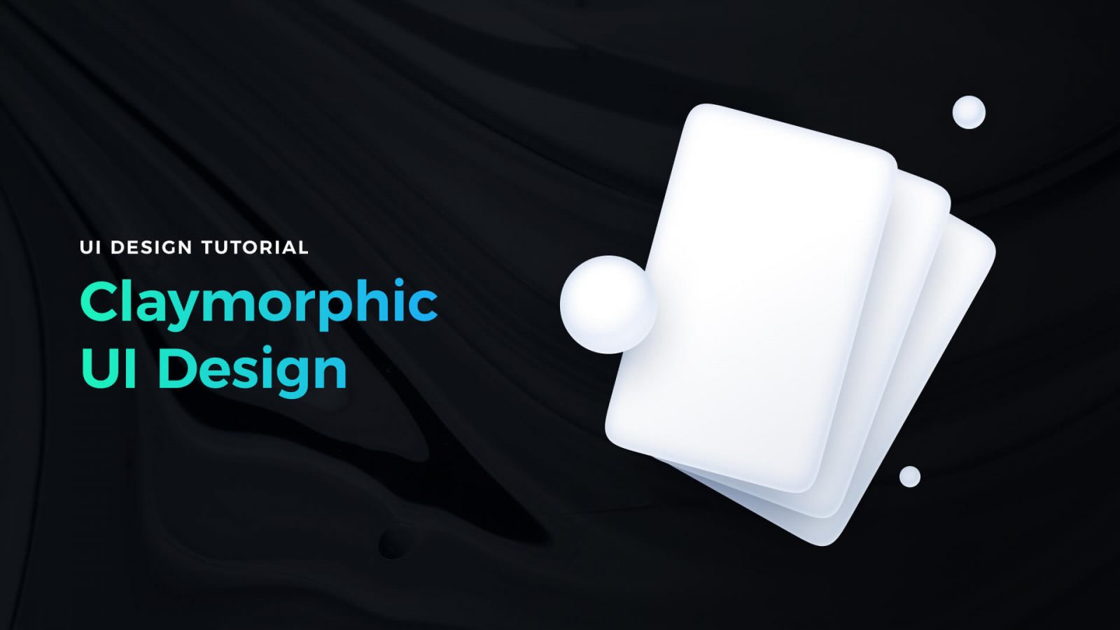
Styles come and go very fast. However, to address the needs of our customers, designers have to be skilled in every modern one. While glassmorphism still feels up to date, there is a trend gaining popularity – Claymorphism. It was
Compare when and why you should use {prototype-fluid} instead of {prototype} in Icons8 Lunacy or Sketch app. The post Tutorial – How to make your iOS prototypes shine like bright stars in the sky appeared first on Sketch2React Blog.
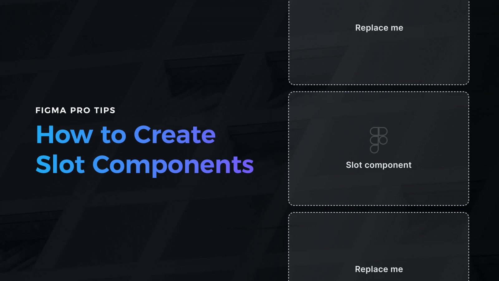
Creating a design in Figma is one thing. The second one is to make it efficient to use. If you want to work faster with your components and UI library, if you’re going to guide other people using your design
One of the most powerful features of Marcode is that you can add custom CSS directly affecting layers and groups inside Sketch or Icons8 Lunacy. Adding a fast and small CSS animation library like Animate.css is a breeze, not to

Challenge yourself to build and ship a complete product in 30 days with a community of supportive women
We just released a brand new companion app for Sketch and Icons8 Lunacy called Marcode. We also released our first premium Sketch plugin, Writer. The post Turn design into iOS & Android apps appeared first on Sketch2React Blog.
Building a portfolio that will help you get a job or a new project is the Holy Grail of most of us. Through the years of my career, I was fortunate to be on both sides – I took part

AI-driven updates, curated by humans and hand-edited for the Prototypr community