Build Design Systems With Penpot Components
Jul 21, 2:15 AM
Penpot's new component system for building scalable design systems, emphasizing designer-developer collaboration.
smashingmagazine.com

medium bookmark / Raindrop.io |
Error messages always mean well. But all too often, they’re confusing, unclear, and leave you wondering what to do next. In this post, we’ll highlight some of the worst error messages we’ve ever seen — and offer tips on how to make sure your errors never make these big mistakes.
One of my favorite characteristics of digital interfaces has got to be snark. Like, I just love it when an app has opinions on my cleverness, appearance, background, or ability to use interfaces.
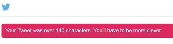
H/t to @angelakilduff (with sympathies for her having to deal with this apparently invulnerable message)
All reports suggest that Twitter has obliviated this highly offensive bit of microcopy “wit,” so don’t go flame them.
Not for this, anyway.
Tweets must be under 140 characters, including spaces.
Doesn’t accuse me of lacking cleverness and it offers me a hint about something tangible I can do to tighten things up — namely, get rid of spaces.
H/t to @thischrisoliver
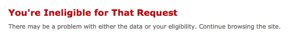
Ummmm … pretty sure I am eligible to make that request, as I did indeed just make it.
Perhaps — and I’m just fishing here — you should have deftly guided me away from making said request, instead?
Also, identifying two possible causes of the error rather undercuts the big red assertion above. Whenever possible, narrow the cause down to one reality, and speak specifically to that.
Without knowing what exactly the user was trying to do here, it’s hard to suggest something different, but a generic revision could start with:
Sorry, due to your permission levels or a mistake on our part, you can’t access that.
H/t to @epersonae
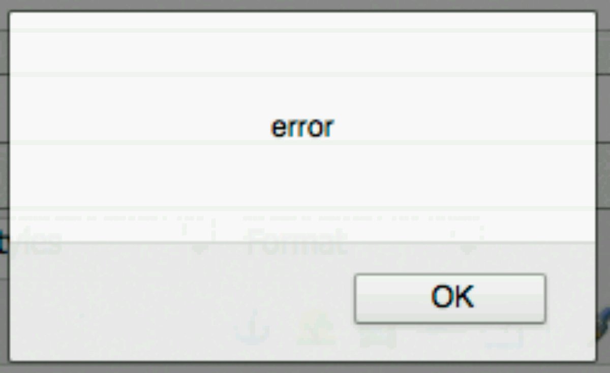
While this error certainly has brevity on its side, it’s not what you’d call … useful. Which is a key characteristic of a good error message.
Without specific details on what happened nor even a hint on what to do about it, I’m left in the dark, battling the yawning void of ennui that only the metaphysically inert “OK” button can adequately express.

Google Docs making a missing image rather alarming!
H/t to @TenShookMars
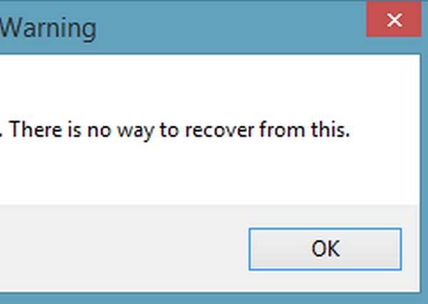
While I’m a huge fan of writing that remains beautifully meaningful with or without context, it’s not the best recipe for an error message.
Nonspecific pronouns like this are all-too-open to misinterpretation — especially of the “this is my life rn” variety.
Anytime you’re writing for the web — be it an error message or a blog post — take a close look at every instance of vague pronouns like it, this, and that and ask yourself if the whole experience wouldn’t be clearer if you swapped in the thing in place of that.

H/t to @abunchofrandom
Speaking of being specific with your people, places, and things: I present to you the classic case of cancelling your cancellation.
It’s an all-too-common scenario in software product UIs. Person acts to cancel something, then decides they actually didn’t want to cancel after all — meaning that both the desired action and the undo action can be described with the same word: cancel.
Thankfully, you’ve got some options:
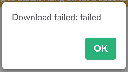
H/t to @AndrewSchmidtFC for courageously volunteering an error from the platform he works on, Slack.
H/t to @designinginward
H/t to @Pamela_Drouin
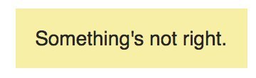
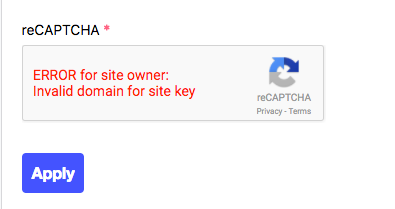
Every product designer, dev, and content strategist has run into the unfortunate case where something … just went wrong. And it’s really hard to pinpoint any single cause.
If you write for product, whatever your role might be, I’d encourage you to push back for more details in a situation like this. Depending on the answer, you might be able to come up with a more useful generalization — such as, “Hmm, it looks like you might not be connected to the internet.”
Even if you can’t generalize, it’s possible there’s a viable solution that will cover many of the unknown causes for the error, such as refreshing the page, clearing your cache, or troubleshooting your internet connection.
And if you can’t usefully generalize, it might well be time to show a little humility.
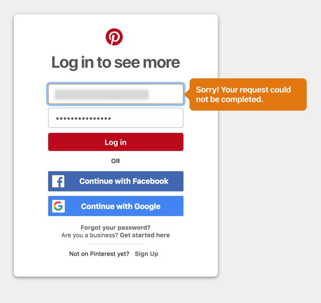
The example from Pinterest above shows promise by starting off on the right foot: Sorry! But it’s kinda downhill from there, as typing a username or email into a form field doesn’t exactly equal a “request” from the user perspective.
Always make sure you’re speaking the user’s language — especially when it comes to a simple interaction like logging in. It’s the small things that can really break a user experience.
H/t to @pbausch
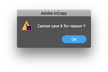
Looking at this lovely modal — ironically spotted in one of Adobe’s few tools specifically for writers — I can’t help but imagine the following scenario:
Engineer: Hey, Writer, what’s our standard for error messages?
Writer: Well, we explain what went wrong, and why. What’s your specific error?
Engineer: Failed save.
Writer: Okay, then basically, “Cannot save X for reason Y.”
Engineer: Got it. Shipped.
Writer: Cool! Thanks for checking.
Ah, office miscommunications that make their merry way into prod.
In this imaginary scenario, the writer was two-thirds right (if neglectful as far as explaining their variables goes). A good error message does explain what went wrong and why (when possible) — but a key third piece is to explain how to fix it. In some cases, the why will make the fix self-explanatory, but not always.
There’s absolutely nothing like broadcasting a message meant for the few to everyone. That’s what email’s for, Google.

H/t to @katiehuangux
Since we started off with horrible user-shaming, it’s only fitting to round things out with a positive example of self-shaming from a software company.
Here, the photo app subtly cops to the limitations of its facial recognition feature — probably not trained on dogs, to be fair — and gives you the option to make it try again with a pithy bit of self-mockery as CTA.
Well-played, folks. Well-played.
AI-driven updates, curated by humans and hand-edited for the Prototypr community


